Basics of Interior Design: Conceptualizing the Morphology of Interior Design
The basis for different interior design approaches is typically derived from the premise of the five main methodologies of this discipline. By comprehending these methodologies, a designer enables their awareness of the ontological classifications of designs. This enablement facilitates the ability to categorize elements of each discipline and how they can be relevant to a particular interior’s narrative. These foundational theories are enclosed physical space, personalized space, phenomenological space, as a backdrop for social interaction, and the interior as a process of interiorization. Understanding these theories, we can then begin to look at the key elements and basics of interior design principles.
Enclosed Physical Space
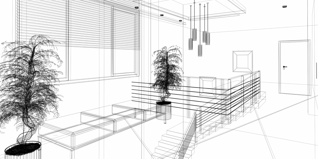
The enclosed physical space concept centres around the inside of the architectural envelope explored from the perspective of vetting the existing encasement.
Personalized Space
Examining interior design from a personalized space perspective, utilizes the expression of clients’ subjectivities and explores the area from a psychological perspective. Consequently, this observes the emotions, attitudes, and thoughts that a place can evoke.
Phenomenological Space
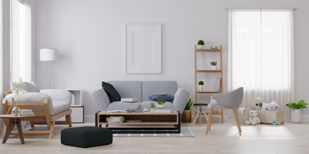
Phenomenological space discusses the conception of interiors in terms of experiential and sensory qualities. Tactility, visual aesthetic, aromas, and ambiguous designs are topics rooted in this methodology.

As a Backdrop for Social Interaction
Investigating interior design as a backdrop for social interaction prioritizes the ethical ramifications typically elicited from public locales.

Interiorization
Here the shift of the interior design approach looks beyond the interior as a preconceived artifact; freeing it from the conceptualization of an architectural envelope to where interiors shape the temporal relationship of people with their intimate built environment.

Basics of Interior Design: Key Elements
Key elements and the typical attributions that facilitate the narrative a room can or is attempting to emanate. As a result, designers exploit these elements for their evocative potentialities.
Door: the Transition
The door can serve to mediate transitions between two spaces or cater to the aesthetic of one interior environment. An important question to ask; would this door be connecting two spaces or dividing them? If dividing, the door is a gateway that can be used to conjure an expectation for the persona of a room that will unravel upon opening the door. This can tactfully be used for adding to the grandeur of the room that awaits. Contrary, if attempting to relay equal weighting to each interior space, it would be wise to use the door as a connection point of mutual interest and purpose to both spaces it segregates.
Floor: Cementing the Experience
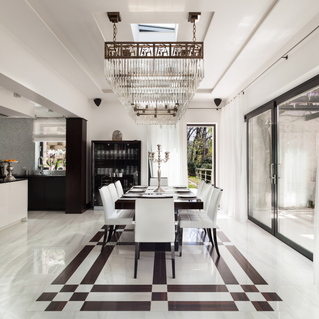
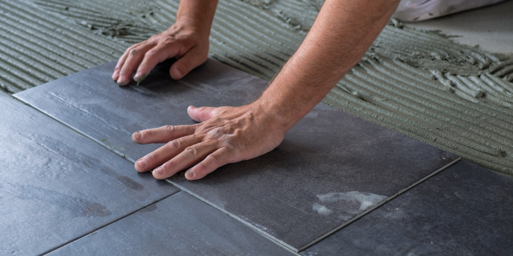
The floor is mainly assessed through its tactile sensation and the degree of detail used in its material. Is the floor designed to elicit an intimate environment or intended for industrial use? Is the floor intricate in its patterning or simplistic? These two questions are important to assess when determining the directionality a floor is catered towards. Typically, darker tones create a more intimate experience whereas lighter shades are perceived as more expansive and move the eye more quickly through the room. Intricate patterns possess more potency to alter our psychological evaluation of a room’s objective; while creating a more methodical observation process for the person. Simplistic patterns move the mind more quickly through the space and help to produce a more spacious feeling.
Wall: Manifesting the Narrative
While walls may induce narrative creating elements through potential patterns, the colour walls are decorated is one of the most pivotal elements to creating a room’s character. General pragmatism about wall colouring concurs, lighter colours and shades make a room feel more open and airy. Accordingly, darker colours and shades play into a room feeling more condensed and intimate in its environment.
Ceilings: Showing History
Completing the totality and airiness of a room, a ceiling and its height help designate the vastness of a room. While a ceiling accomplishes these elements, typically the significance of these components is examined for the zeitgeist they give away. Therefore, ceilings show a room’s legacy and reveal further context to the era of the space. Consequently, knowledge of this allows designers and viewers to distinguish the anachronistic characteristics of the current contemporary.
Window: Communicative Interface
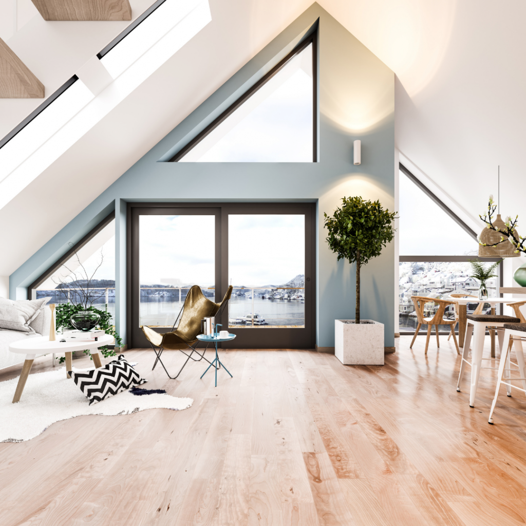
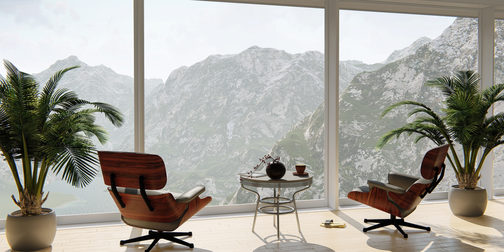
Windows help in the process of brightening up a space and making it feel more open. While this is typically the key concept synonymous with windows; they further orchestrate a communicative interface uniting interior and exterior, providing interaction and views. Dissecting a window for its offerings in this manner, help a designer actualize the finest placements to utilize them. In a sense, they can be conceptualized as a real-life picture frame added to the interior of a room that showcases an exterior extravaganza.
Basics of Interior Design: Interior Design Principles
Balance: Juggling Objects
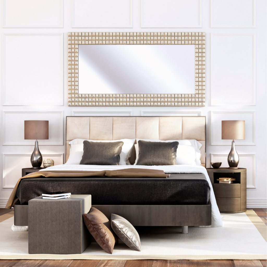
Balance, creating the feeling of equilibrium. This objective of balance is achieved through properly approximating the visual weight each object in a room carries. Visual weight is most objectively created through object shape. Additionally to this component, colour, pattern, and texture also play a role in creating a room’s balance. Identifiably, there are three main different types of balance. The most common is symmetrical (formal), typically a balanced style reserved for traditional or formal spaces. This is identifiable when a room can be split into sides that mirror one another in terms of visual weight. This prototypical approach to balance can become monotonous and banal when not executed to a high standard. Be sparing and make sure to utilize the key focal points of a room to negate this problem. Not exactly contrary to symmetrical as the name would suggest, asymmetrical (informal) still attempts to balance visual weights but through unconventional manners instead of direct duplication. If executed correctly, it can lead to visually polarizing interiors that seemingly work. This approach, for instance, could attempt to balance a large sectional on one half with a strikingly colourful ornament on the other side. The last balancing style is considered radial. As suggested by the name, there is a central focal point with items positioned circularly around the focal object. The quintessential example is a room with chairs focused around a central table.
Rhythm: Getting into the Grove
Rhythm like a well-choreographed song prioritizes generating patterns of repetition and/or contrast in an attempt to spark visual intrigue. As a designer, you can emulate this by using the same colour or shape at varying intervals. The intention of creating rhythm is to move the observer’s eyes around the room. For a starting point, try picking a colour and repeating it through different objects in the same room. Eventually, when the technique is built, you can try replicating this through repeating objects, shapes, or even abstractly through analogously emotive objects.
Harmony: the Message
In dance, when the song, dancers, and lighting are all in sync, watchers realize the intended message of the performance in astonishment. Creating a room that has harmony utilizes all its elements to create a unified message. To achieve harmony, you must correctly apply the other 4 design elements. If harmony is attained you have successfully incorporated all the basic design principles into your interior.
Emphasis: what are you Looking at
In a room with objects of equal significance, people will feel uncertain about where to place their attention. This is why a room needs to incorporate an anchor piece. Having points of interest help users establish a commonplace to situate their attention. Anchor points incorporate tangible, psychological, symbolic, and semantic elements to comprise phenomenological stances. The fireplace is a typical built-in anchor to a room. Its properties are unique, they have varied over the generations and nowadays functions not only as a source of heating but furthermore as a source for relaxation and coziness.
Proportion and Scale: Find the Gold
Proportion is the ratio of one part in context to another; scale is how the size of one object relates to another or to the space in which it is placed. Theoretically, humans have determined optimal proportional distances through the formula of the Golden Ratio. This occurs when the two objects’ ratio is the same as the ratio of their sum to the larger of the two quantities. From this proportion, you can then scale accordingly following this formula’s parameters to achieve the most natural-looking results.


